

Neuromancer book cover re-design, as part of a look back on the projects I’ve done this year so far, during and after the MA.
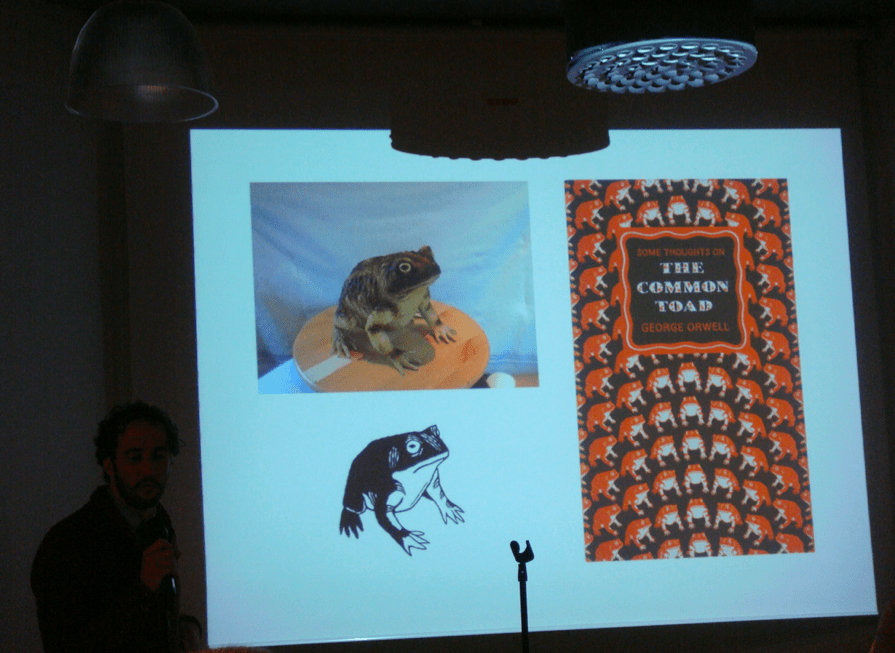
On my trip to London last year, I picked up a copy of Some thoughts on the Common Toad, by George Orwell. The cover was beautiful and I decided to bring it back as a present to my (then) teacher and friend Maziar. When he got it, he mentioned it was designed by David Pearson, a wonderful designer from Penguin. David is a great designer in contemporary graphic design, and we were lucky to have him earlier this year at Khio, giving a workshop on book cover re-design.
I participated in this workshop, and the task was to re-design the cover of a book we liked. We started by selecting a genre and doing visual research of the existing book covers within that genre. Afterwards, we sketched ideas and started to create mock-ups of our re-design. This process was guided by David, and he also showed us his latest work, inspiration and love for letters, books and type as image. We continued into the final design of our book cover, and presented to the whole group in the end. David’s perspective and critique was really helpful, and it was a pleasure to have him over. He also gave a talk at Grafill during his stay in Oslo, showing his work and talking about his process.
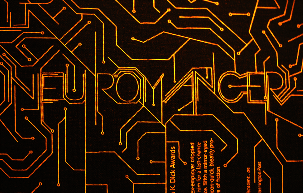
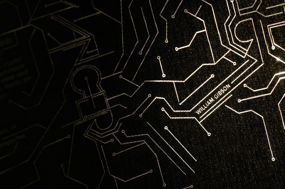
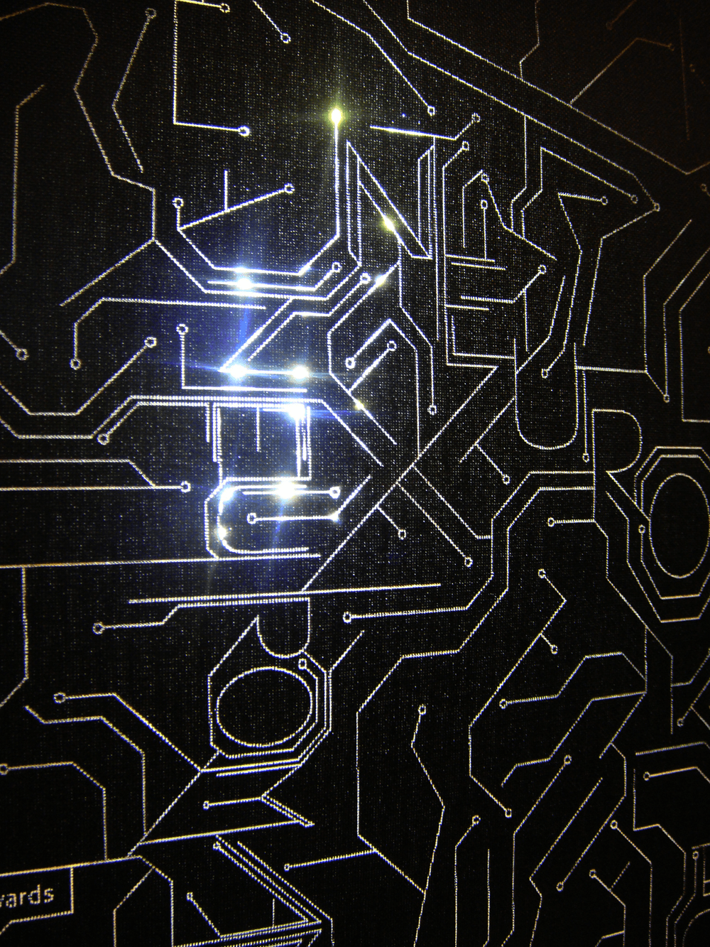
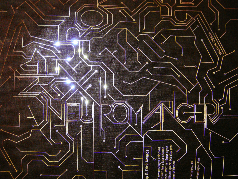
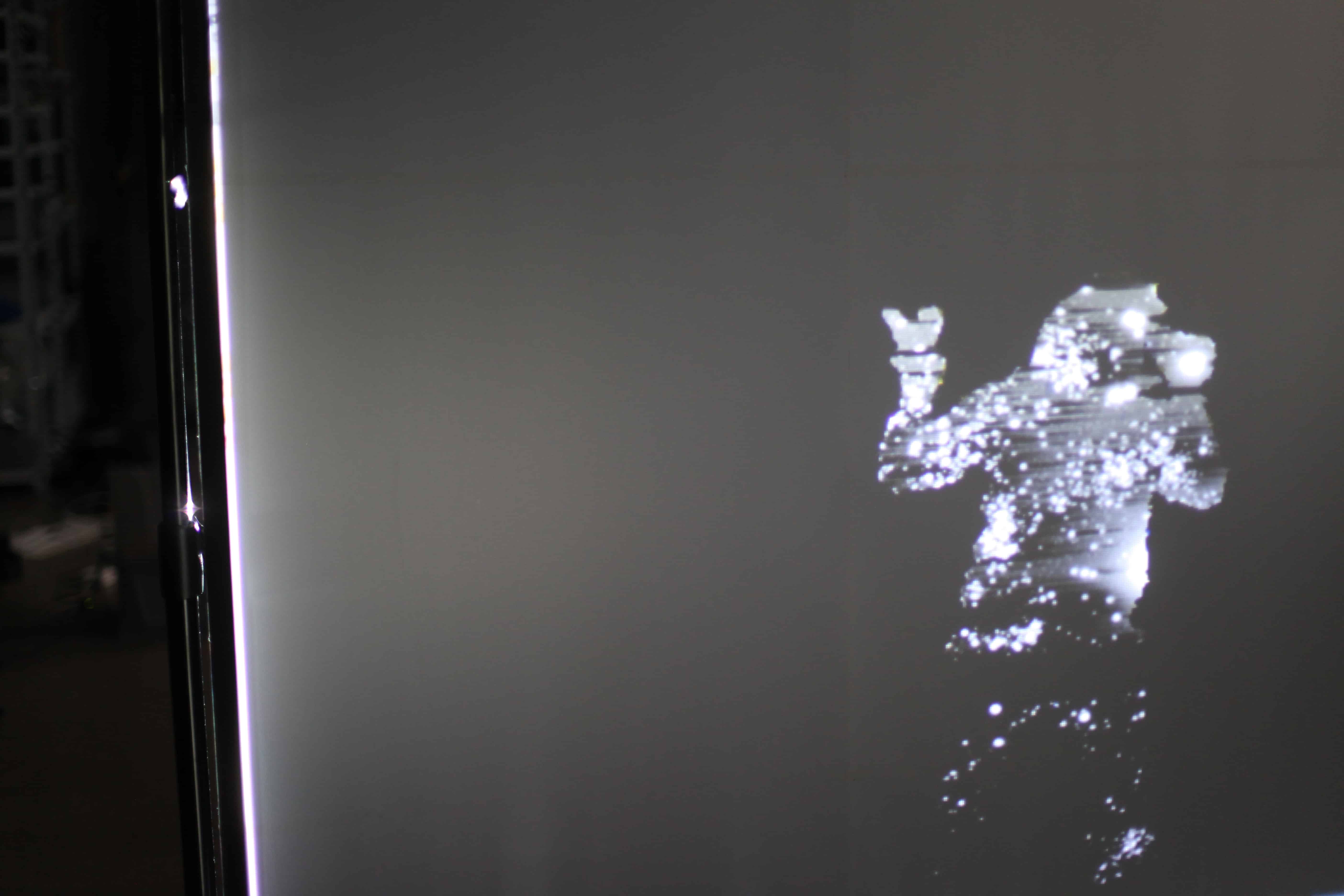
The book I chose was a personal favorite: Neuromancer, by William Gibson. Sci-fi book covers from the 60’s and early 70’s are gorgeous: there is a tactile quality in them. As I did visual research, I found that this could not be said from sci-fi book covers from the 80’s, and I thought this was an area of opportunity I could explore in this workshop. I created a book cover creating a texture and pattern made from a circuit board motif. The title of the book emerges from this pattern, both for the cover and for the spine. I created paper versions of it (paperback), but I wanted to push it forward, so I used the laser cutter to engrave and cut the design on book cloth. After that, I explored options with neon paper underneath, and finally, with LED’s (LED wallpaper would be wonderful, as a first layer of the book cover). I had a lot of fun creating this re-desing, and loved to have David with us!
You can also check out this project in my website here!
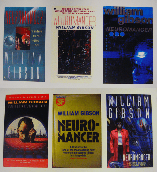 Visual research
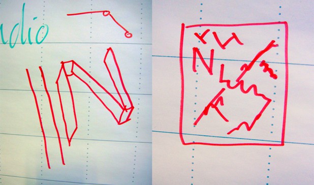 Initial ideas, concept exploration
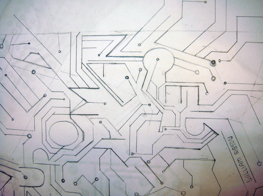
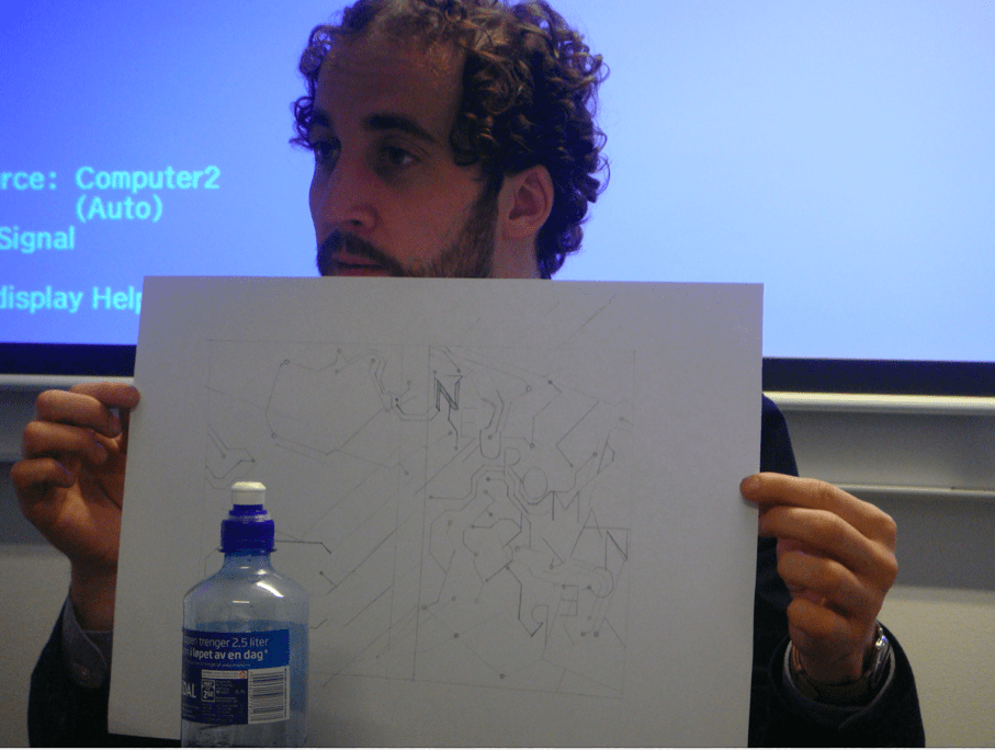
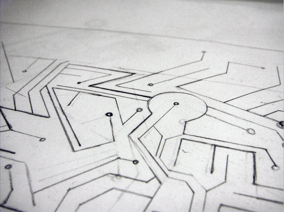 Process: sketches for the layout

 David at the crit.
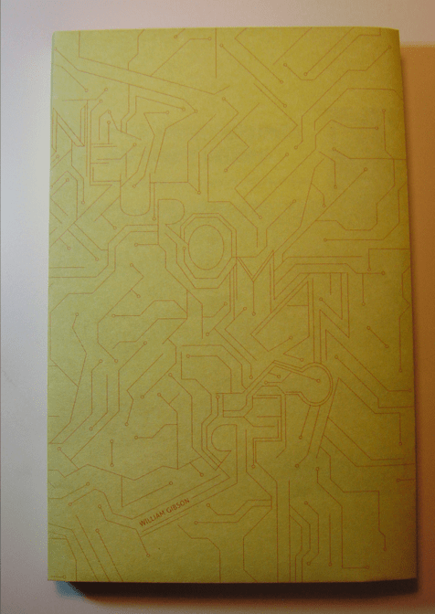
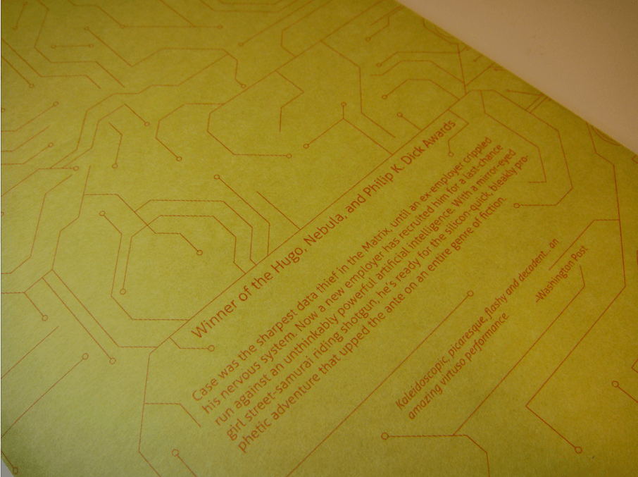
Paperback version

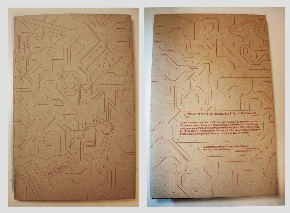 Second paperback version.
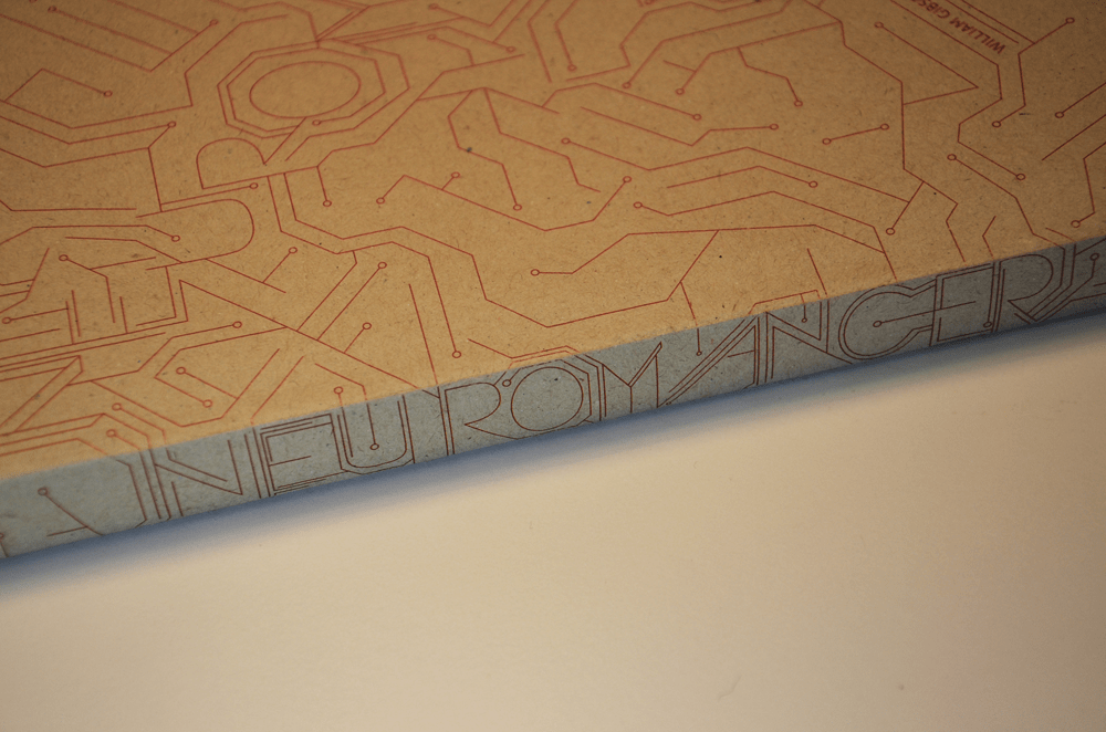
 Before and after, front cover.
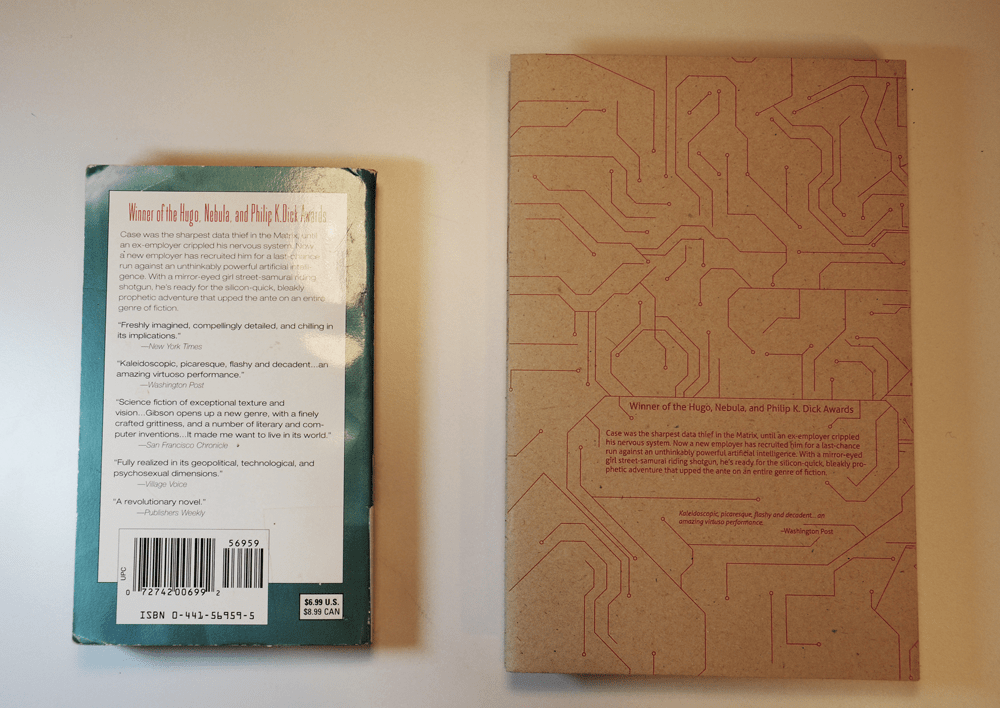 Before and after, back cover.
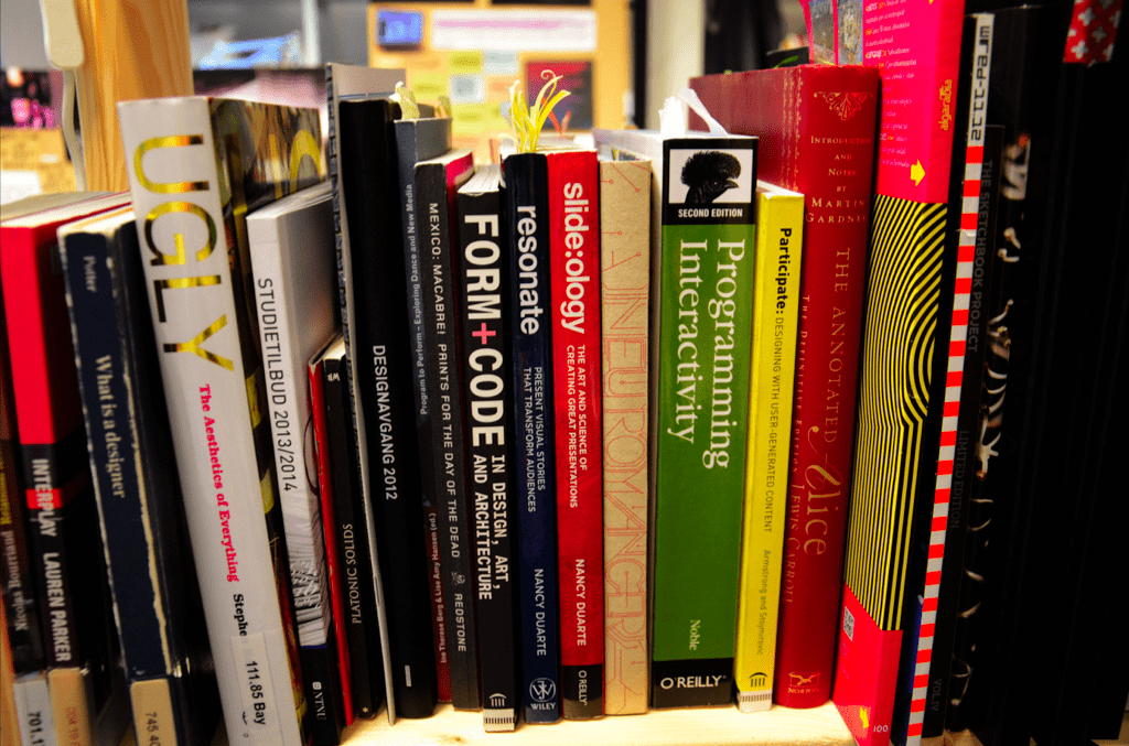 The book in context.
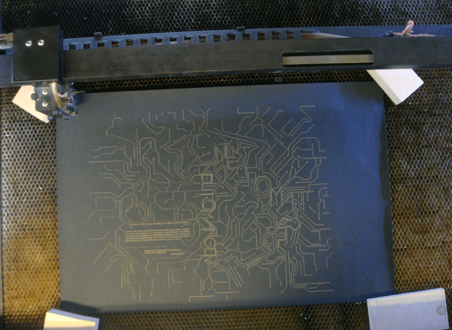 Playing with the laser cutter!
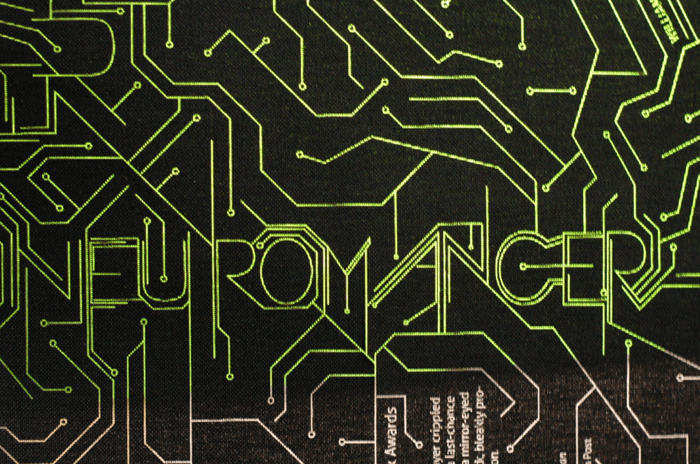 Explorations with neon paper underneath the book cloth.
 With LEDs underneath the book cloth.
 The whole layout.
 David Pearson at Grafill.
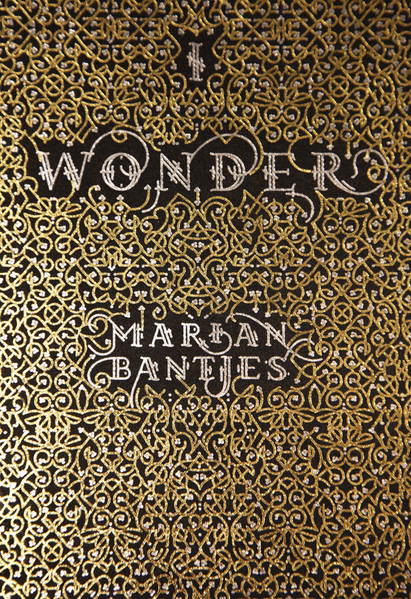
 The book cover that started my interest in David’s work.

